Typesetting is hard
Typesetting is Hard
Well to clarify, for most writers it’s probably not. But my book probably has several considerations that most people don’t for literary formatting:
- CJK Font Dependency: I use a lot of NOTO China/Japan/Korea fonts for Yomi’s text
- Full Color Unicode Emojis: Because a lot of the book (especially early) occurs digitally, there’s a lot of emoji use.
- Fenced formatting: I use this to generate a styled background for Discord conversation in the book to make sure that they stand out
Even in the cases of the above, generating an EPUB is a lot easier than typesetting for a print run. The reasons are basically in the origins of the EPUB. For those unaware, an EPUB is basically just a zip archive with a bunch of formatted HTML. So the context is that a computer is running this in a markup format and the hardware / software does most of the heavy lifting.
There are some oddities that come from my scenario here, such as the need to embed fonts, but that’s not as complicated or unheard of nowadays as it used to be, but for the most part, once the fonts are embedded, an EPUB just works beautifully.
Paperback - The Pages
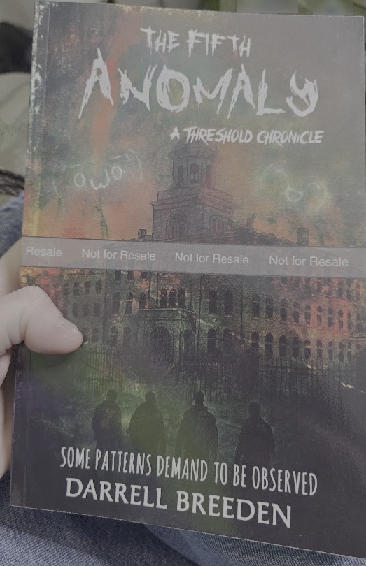
So after the release of The Fifth Anomaly: A Threshold Chronicle on digital formats for Kindle, I decided “I’ll see what work this will take for a paperpack” and boy was I not prepared for the sheer amount of work this meant. I knew the easy parts. What I would charge. Markets to sell in, but there was way more I wasn’t thinking about:
- What are the dimensions for the paperback (I went with 9x6)
- What paper medium are you using? (I went with Cream)
- How many pages
Wait. How many pages? Well I guess that does make sense. If we’re formatting to 9x6…there’s math here. Oh! No problem! Amazon will help you estimate it!
Insert Klaxon Noises and Chaos
You just have to be able to provide a print-ready PDF. That seems easy? Right? Well it gets crazy the more I had to dig into it, because this central concept of the file fans out to a lot of other things. First off though, my CI pipeline was already generating a PDF! Sweet! I’ll just upload that and…

Oh yeah. I guess the gutter spacing…does matter as well as preventing the entire page from printing to the edge. The good thing is that the KDP evaluator does a good job of pointing out page by page of issues where the provided manuscript doesn’t fit in the spacing provided.
A lot of this for me stems from two things:
- I’m writing in markddown and converting with pandoc
- I do have large sections of code blocks
The problem comes from code blocks being treated as isolated monospace font blocks. Basically even though in EPUB it’ll break at the edge and look clean, in a print perspective pandoc is just yeeting it onto the page.
Those are pretty straight forward once you have a list. Go through them, make the changes manually to ensure they’ll fit, re-upload and see how it’s going to be.
So after all of that, you’re done. You’re finally done? Right?
Wrong
This is just where you finally get to figure out your page count for the given size of the paperback.
The Cover - Hope You’re Ready
So this is the part I was not ready for. I had paid someone on fiverr to make my original cover which came out fantastically.
The concern was now that the cover itself has to be modified to actually stretch over the dimensions for a 9x6 book at X pages. So from what I read this is a pretty common consideration in the industry, so I reached back out to the provider who was not interested in doing the work.
There’s nothing I hate more than Illustrator / Photoshop work, but I did get a .PSD from the vendor, so I figured I’d start there. “I’m sure it’s all layered” I told myself.
Whoah boy was I wrong. I was able to extract the fonts used by the cover cleanly, but I needed to have them for the cover to look the same.
Ethical Considerations on Fonts
Crimes Times Six and Cannibal are the fonts used for the cover of the Fifth Anomaly. While I had paid for a contractor to provide the cover, the fonts were used, but as such would have been covered by any font agreements the contractor had in generating a product.
Me now modifying it is a different story. I went ahead and forked over the $45 per font to the creator to ensure I have a license for it. A lot of that comes from years of software development where we have to be cognizant of licenses for upstream dependencies etc.
tldr;
If you modify it, you need the rights to use the fonts.
The Layers
Then I come to the realization that the cover was not layered. It was just one flat layer with some text dropped onto it. There’s tools for handling this in photoshop, but they honestly sucked.
What I ended up doing was drawing lines where the seams are and cutting the main cover into three parts:
- Back Cover
- Spine
- Front Cover
I then laid the template provided by Amazon as a foundational layer for measurement and began moving everything around. I pulled both the back cover and front cover to the edges. That essentially means all space left in the template goes into the spine.
I used Photoshop’s generative extend functionality to fill the space and carry the bleed over from the main cover onto the spine. It worked great, but we’re looking at a file not an artifact it produces yet.
You have to generate the PDF (because they’ll only take print ready PDFs for the cover) ad 300 dpi at the specific dimensions. The hard thing for me was realizing that the DPI -> dimensions are locked together unless you unselect them. Was trying to figure out why my cover was like 164 mb.
Once all that was finally done, the final of the seven labors was complete and I could actually see it without any failures or errors.
The better part of me told me to order a proof and verify. I’m glad I did.
Ligatures and Polyglot Problems
When it came in, it looked good. The cover was great. I had managed not to fuck up the alignment of the central text on the spine.
But as I started looking through the document, I noticed a recurring problem
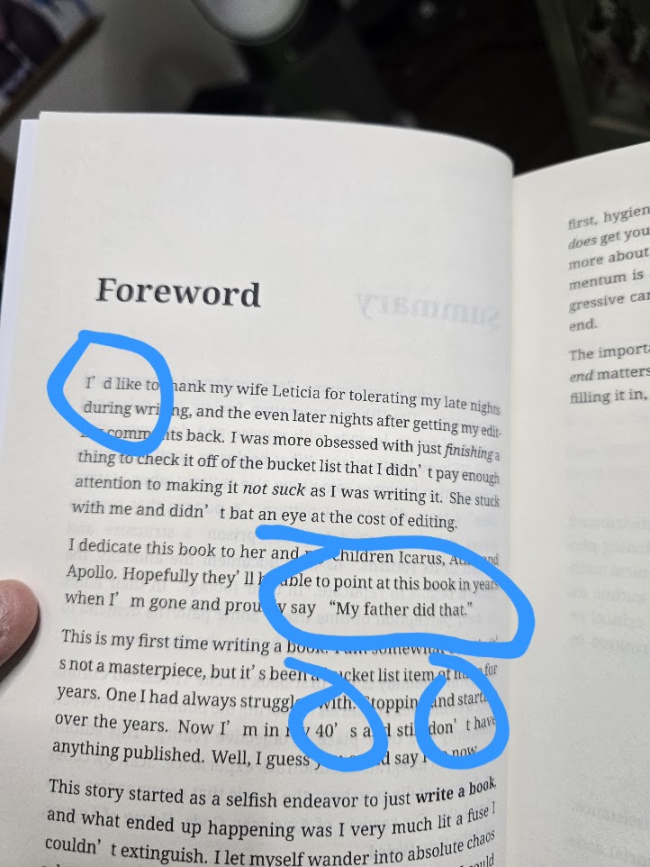
As you can see, anywhere there’s a ' or " there’s an extraneous amount of space. I resisted the urge to say “fuck it” and publish it anyway and dug into what was happening.
Fundamentally this is a side effect of a short cut I took for CJK fonts as well as how CJK fonts treat ligatures as they’re very different from western languages.
The Shortcut
During the intitial pass at trying to get a PDF to render directly, there were three problems I had to solve for:
- CJK Fonts (for practically all of Yomi’s text)
- Full Color Emoji Fonts (Only on three pages, but for impact)
- Discord formatting via fencing
Originally these three things were done via lua scripts at the point of pandoc generation. This basically forced latex to generate things a specific way. The approach was:
- One lua script would make images of the color emojis and add them to the assets. It would then place the image where the font was and resize it on the page
- One lua script did ther formatting for the fencing
- A third (polyglot.lua) started defining byte code mappings to say “if you see this character, use this font”
The third script got ugly and after like 9 iterations I as only 30% of the way through the characters. It was faster to just define the CJK font as the primary font for monospace fonts and boom. I was done.
Technically
Well technically I was done, but what happened is that it expressly causes the behavior you see in the image above. Because the CJK font is the primary, it defines the behaviors for the ligatures (quotes, commas, apostrophes etc) and that font gives a wide swath of space after a ligature.
Finding it was even a pain. I went through a process of generating the book over and over again, manually enabling and disabling lua fonts. It wasn’t until I finally got to just removing the CJK font as primary and re-enabling all the LUA scripts that the kerning issue went away.
It did, however, break rendering since only 30% of the characters are mapped via polyglot.lua. So I had to finish building character maps for the lua script. It was grindy work, but once it was done I didn’t have any spacing issues, no issues with missing fonts, and something that’s a little less jarring to read.
To Proof or Not To Proof
At this point, I had already seen the cover came out fine, and the primary encoding / formatting was preserved in the PDF. I opted not to move to another proof, and just publish on the new version of hte book (v1.0.8).
I ordered three authors copies, but it’ll take a week or two. Once a book goes into KDP physical publishing there’s 7-10 days of just prepwork. In the end, it was all worth it to make sure the paperback comes out as well as it can, but man it was 600% more work than I thought it would be.
Considerations on the Formatting Industry
The funny thing that I found out is that formatting is traditionally one of the most expensive parts of the industry. Editing was expensive for me ($1400 for a professional editor), but apparently people can spend 3-5 times that on formatting.
I actually had a meeting with Dorrence publishing (for marketing as I had mentioned) where I pointed out that I wasn’t interested in formatting or editing as both are formally done at this point. Because I could already produce a printable copy via Ingram or KDP, most of the value they add as a vanity publisher was gone.
Their marketing options were basically “post it to our site” and I’m sorry but I’m not giving up royalty or cash up front for that.
Simply put, formatting is hard but not impossible. And you don’t even have to understand 100% of it nowadays with the advances available in AI. Claude / Gemini did most of the intial evaluation of the pipeline to figure out what may be causing the issue.